Do you often speak to your designer and not understand what they are asking for?
Are you unsure if they actually speak Latin and are confused as to why there is Lorem ipsum in your brochure proof?
Or, are you genuinely concerned for their welfare when they mention ‘spot colours’ or ‘bleed’?
We thought it was about time that we covered the most popular things that you may hear, but not fully understand, when chatting to design folk. Here are 18 terms to get you started.
Colours
1. Process Colours
These are best known as full colour, four colour and CMYK. Made up using Cyan, Magenta, Yellow and Black (or Key), percentages of these four colours are mixed to create a range of colours for printed material.
2. Spot Colours
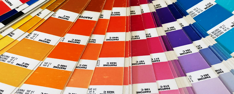
Spot colours are pre-mixed inks printed from a dedicated plate. These colours are part of a universal colour matching system, i.e. Pantone, and will look more consistent and vibrant, than if printed using CMYK.
3. RGB
RGB (Red, Green and Blue) makes up the colours which we view on screen. A range of colours are made by mixing these colours together and Hexadecimal codes are created for each colour i.e. White = #FFFFFF and Black = #000000
4. Bleed
This allows the artwork to run beyond the edge of the page, to allow for any movement during the printing/trimming process. Usually, the industry minimum is 3mm all the way around the document. Crop marks are used with bleed to indicate the trimmed size of the artwork.
5. Finishing
Along with the stock, the way a product is printed is a key consideration during the design process. This ranges from digital printing, ideal for quick turnaround, or lithography which uses wet ink and metal plates, best for longer runs. We also consider additional finishes including foil blocking, spot UV, embossing and laminates to add to the overall finished piece.
6. Stock
In layman’s terms, stock relates to the paper or substrate that is getting printed on. Coming in various sizes, weights, finishes and colours, the stock can enhance the quality as well as play a big part in the overall look and feel of the finished artwork.
Type
7. Lorem ipsum…
Also known as Greek, placeholder or filler text, Lorem ipsum is text that is temporarily added to artwork demonstrating how the design layout will look, in the absence of client supplied content.
8. Tracking / Kerning
Same principles but still very different. Whereas kerning is the space between each individual letter in a word, tracking looks at the letter spacing for the entire word. These can also be set up to look correct visually (optical) or so each letter has the same distance apart (metric).
9. Serif
Classed as more traditional typefaces, these fonts have the small lines that begin and end each character stroke. Serif fonts that you may have come across include Georgia, Times New Roman, Baskerville and Garamond.
10. Sans Serif
In short, Sans Serif fonts do not have these lines. Sans is the Latin word for ‘without’ so literally means ‘without serif’. Well known fonts include Helvetica, Arial, Futura and Century Gothic.
Images
11. Vector
Your designer may have asked for a vector version of your logo. The vector version can be scaled to any size, as it is made up of lines and curves, rather than a flat, rasterised version which can’t be. Common file formats include AI, EPS, SVG and in some cases, PDF.
12. Rasterised
The majority of images we see in publications and online are raster images. Using a grid of fixed, single colour pixels to make up the image, they can easily lose quality and pixelate when scaled up. The higher the resolution of the image, the more chance we have if setting it to the required size and keep it as sharp as possible. Common file formats include JPG, PNG, GIF, BMP and TIF.
13. Mockup
A mockup is a realistic 3D render of how finished artwork may look. In most cases these are used as part of a concept proposal and can range from printed material - flyer, brochure, business card - to websites and apps.
Web
14. Prototype
The term prototype is used for the initial design proof of a website. Prototyping software allows us to upload a series of images and add links for key pages, so that the client can get an idea of the look, feel and basic functionality that their site will have.
15. Responsive
Websites these days are viewed on devices with varying screen sizes. Building websites that are responsive allow the content to fit to the screen size that it is being viewed on, without losing impact or having to scroll left and right to read the information.
16. Above The Fold
This is the area of the website that is viewable as soon as the user lands on the page (without scrolling). The information that sits in this area should clearly outline what the user can expect from the products or services and in most cases, have a call-to-action.
17. Resolution
Resolution has two main forms. DPI (dots per inch) and PPI (points per inch). DPI is used on printed materials and should generally be 300dpi. PPI is for images that are viewed on screen and as a rule need to be 72ppi. In both instances, the higher the resolution the better the image quality.
18. Web Safe Fonts
These are fonts that will work perfectly across all browsers as they are more likely to be installed as part of the operating system. Now, there is Google Fonts which works in a similar way and opens up a lot more fonts, assuming that the user is using Google Chrome.
In summary…
Hopefully, you feel a little bit more equipped to speak 'Designer' and understand what we are talking about. We have just covered 18 terms today, but please always ask if there is something you are not sure about and we’ll explain in more detail.
