As the saying suggests, ‘New year, new start’, a number of national and international brands made the decision to rebrand in January.
Indeed, as we’re all organising our lives, homes and offices thanks to the Marie Kondo movement, some of the biggest brands took the opportunity to launch rebrands with varying levels of rollout and success.
Take a look at our selection of three of the biggest rebrands from January 2019 - Slack, Zara and Kate Spade.
Slack
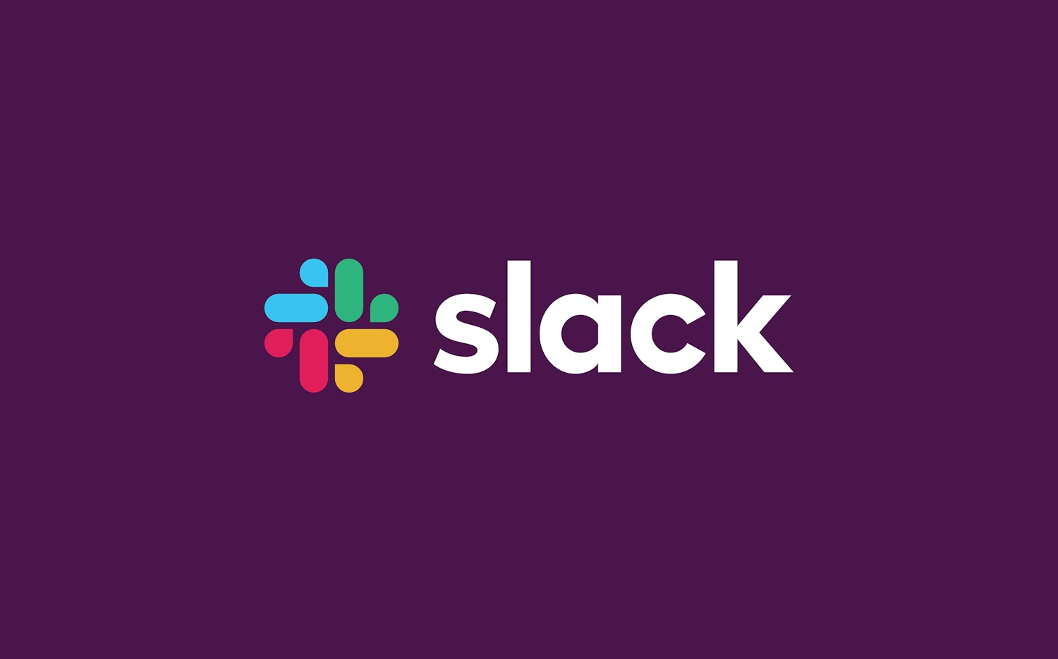
Source: Pentagram https://www.pentagram.com/work/slack/story
Slack’s new brand design reflects the simplicity of the collaborative platform and is the first major change to the platform’s design since its launch in 2013.
Created out of a collaboration between Slack’s in-house designers, Michael Bierut and Pentagram, the new logomark has brought the original 11 logo colours into just four simple hues of the primary colours, red, yellow, green and blue.
Source: Pentagram
The original logomark was described in a Slack blog post as “simply awful” because of the way it translated on different formats and colour backgrounds, although they liked the way it was “distinctive and playful”.
It does retain Slack’s recognisable aubergine purple as its accent colour, which is found in the platform’s main communication channel.
Source: Pentagram
The design will be rolled out across advertising, its website and the software in the coming months.
Zara
![]()
Source: Fast Company
Receiving mixed reviews, fashion brand, Zara, dropped their new logo at the end of the month, with a shift away from the simplistic text logos we’ve come to expect from major brands.
The logo remains font-only, but there is very little space between each letter and the Z and R have a considerable curve which adds to the confusion of the heavy, all-caps logo.
Described by Creative Bloq as being “kerned into oblivion”, the logo was created by design firm, Baron & Baron, whose founder is “known for this kind of compressed, overlapping spacing, and also created much of the visual imagery for Zara’s newly launched marketing campaign” (Source: Fast Company).
Source: Baron & Baron
Suggested by some as a sign that the company is establishing its rightful place as a long-standing company by opting for the controversial logo, as opposed to the simplistic styles and logos of startups and modern brands, what do you think of the end result?
Kate Spade
Source: @katespadeny on Instagram
The somewhat iconic brand made a risky decision in January to update its secondary colour, from clover green, to a shade called “pink kiss”.
Although the fashion brand, known mostly for its handbags, has mostly retained its long-standing core identity - a black spade which sits above the Kate Spade name, it has also made some changes here too.
Its “spade” element is now much larger and, in some cases, is replacing the writing altogether.
“Pink kiss” will replace its clover green tags and some signage where the shade appeared.
Kate Spade’s Instagram page has also unveiled that the dustbags which package its handbags’ are also in the new pink shade, which were brown with hot pink string and gold lettering.
Source: @katespadeny on Instagram
The rollout follows the death of the brand’s namesake founder, Kate Spade in 2018 (although she stepped away from the brand completely in 2007) and also coincides with the launch of the design house’s Spring/Summer 2019 product launch.