Any organisation that has been through the rebrand process will know that it can be a risk - even in the smoothest and easiest of rebrands.
Luckily, most companies go through the process unscathed and come out with a stunning, on-point brand that suits their audience and messaging.
However, there are some organisations - huge organisations - that have been damaged by badly executed or poorly thought-out brand projects.
Tropicana
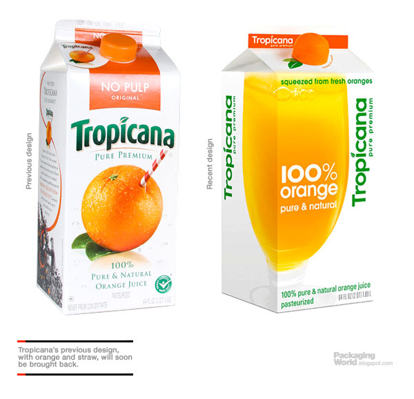 Image source: PS Print
One of the most recognisable juice brands around, Tropicana sells millions of its product every year but an awful rebranding exercise cost them dearly a few years ago.
With "down to earth" in mind, the simplistic design that they went for didn't go down too well with customers. Many felt as though it was no longer recognisable as the long-loved Tropicana and simply walked past without noticing the new style packaging.
Cost: 20% drop in sales resulting in the juice brand going back to its old, recognisable look.
London 2012

Image source: Wikimedia
The infamous London 2012 Olympics logo (designed by Wolff Ollins, 2007) was met with sneers and sniggers both by the design world and general public, with lots of suggestions as to what it resembled. Lisa Simpson doing something naughty, anyone?
The organisers felt brave and described the branding as:
"Our emblem is simple, distinct, bold and buzzing with energy.... It feels young in spirit... Not afraid to shake things up, to challenge the accepted. To change things."
Cost: It is reported that the logo cost $625,000 and is probably the only proof you need to know not to mess with a classic...
GAP
... Messing with a classic is something that high street brand GAP tried (and quickly rectified) in 2010.
![]()
Image source: Under Consideration
A lot of designers say that this was the worst attempt at a rebrand in living memory. Deciding that their classic logo mark was showing its age the company went for a brand new look, seemingly overnight, with no warning whatsoever.
The feedback was astounding, so much so that GAP did a U-turn on their new look in just six days.
Cost: It's unknown how much this six-day new look cost... Some would argue it might pale into comparison from the publicity they received...
Which rebranding disasters are iconic to you? Share them with us at @ThriveHQ.