Today, we were treated to our first look at the slowly rolled-out Twitter redesign.
The desktop site has had its first major overhaul for some time, with a complete revamp of the location of key features including the navigational bar, trending topics and your own profile content.
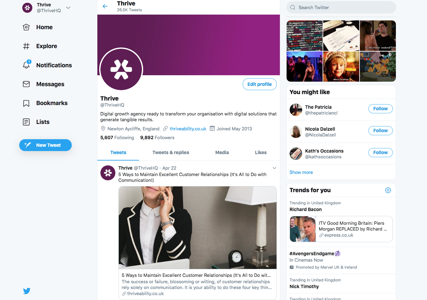
Above: Profile view on desktop
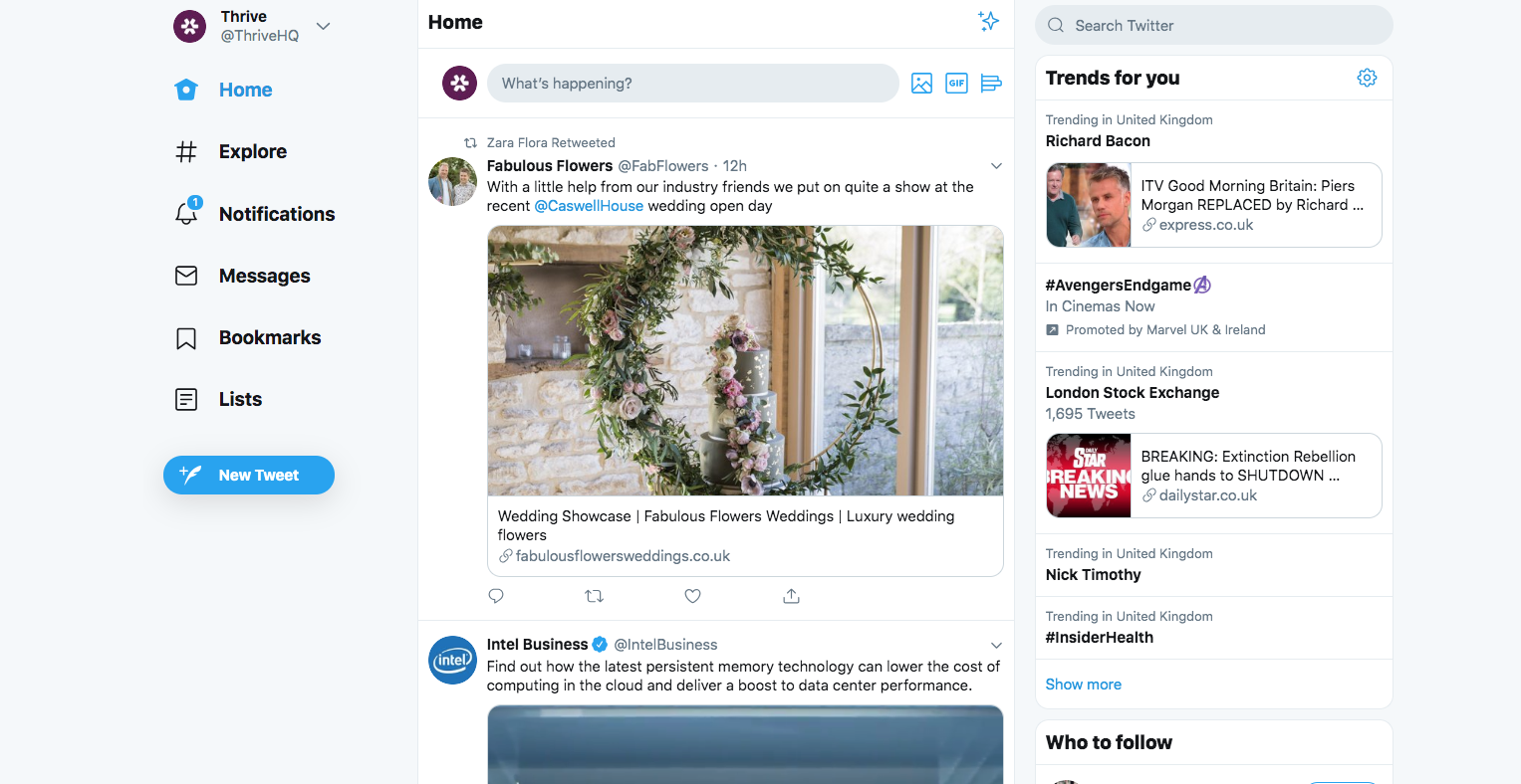
Above: News Feed view on desktop
With a definite design choice being made to focus on simplicity, to provide more options for interactivity and a clearer view of individual tweets (more scrolling necessary, people!) the design has already been met with a lot of negative reactions... Maybe, people don't like change?
im so sick of minimalism please just make everything easily accessible whitespace doesnt make your website better i feel like my computer just turned into a tablet #TwitterUpdate
— 🤷♂️ (@Matthauw) April 23, 2019
Put the old page design back, twitter. This is a cluttered mess without rhyme nor reason. Everything's small and crowded. What were you thinking? #twitterupdate
— Cobalt (@chrissutor2) April 23, 2019
Oh my God. @Twitter. This redesign... is BAD. It's like I'm back in middle school before MySpace. WHY. WHY. pic.twitter.com/R7MOCrhh4B
— Menardi B (@IanMenard) April 24, 2019
A number of key features have disappeared from obvious view including News, but you can still switch to dark mode and, for the time being, revert back to 'legacy view Twitter' (the old layout).
How to reactivate the old Twitter layout
Some users can reactivate Twitter from their main menu (although we don't have that option on April 25, 2019).
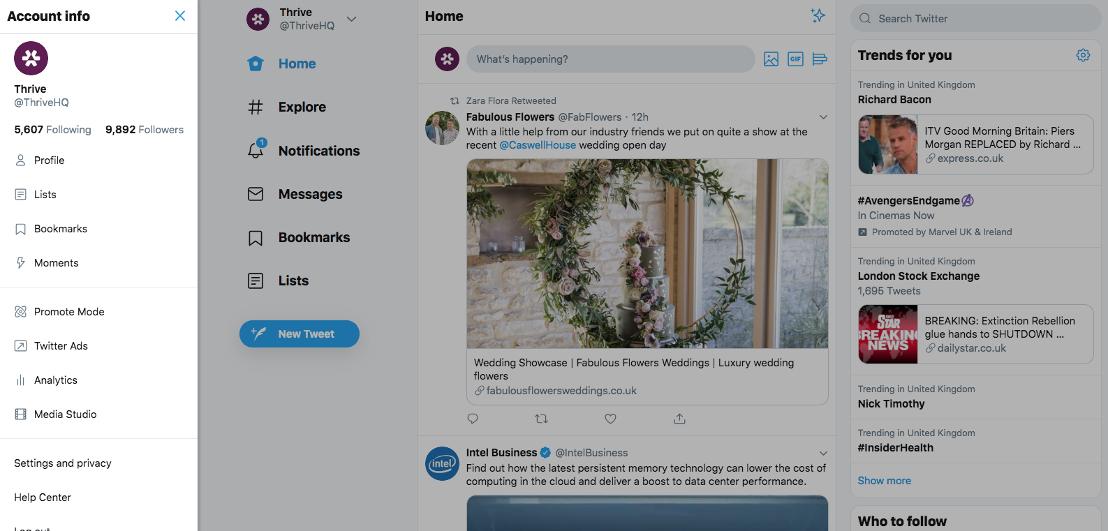
Above: Settings on desktop
Find out more from the world of social media and Twitter across our blog.