Rebranding projects are always my favourite projects to work on, as they are challenging, but extremely rewarding.
For this particular company the task was to modernise and humanise their current brand to re engage current and attract a new wave of clients in a modern marketplace.
Rebranding is about more than just slapping up a new logo and calling it a day. It’s about helping the company, and its clients, switch gradually and confidently making sure the new brand is aligned with the same values and qualities it has built up over time.
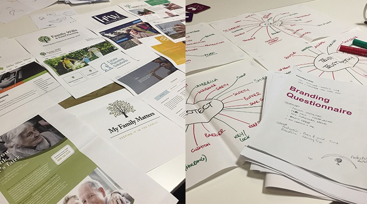
Going through the branding process allows you to immerse yourself in how to the company works and what message they want to portray, conducting initial research is vital to making sure the new brand is in keeping with the sector but also stands out.
The old brand was dated and didn’t have any kind of visual identity attached. The brand felt lost in the sector and didn’t really stand out as a lot of the competitors used similar colours and imagery.
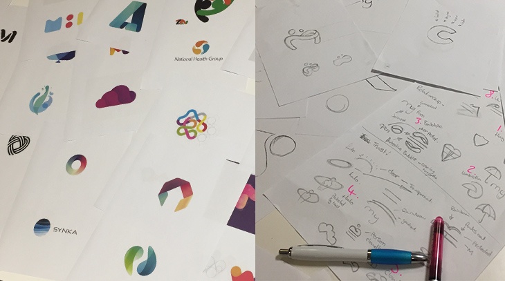
We start by analysing the company’s main three brand values, helping us gauge what the new brand has to look and feel like. This also acts like a checklist and reference point as we develop the brand - MFM has to show protection, trust and transpsarency.
![]()
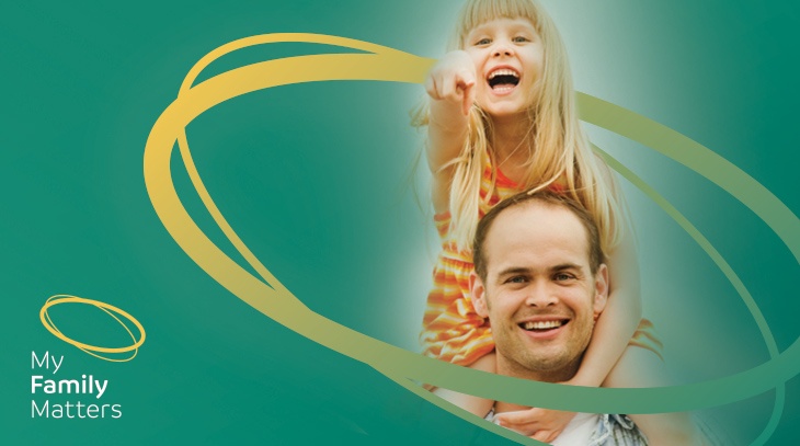
The new brand is simple and easier to understand, adaptable and modern. The new logo mark emulates a halo shape giving an instant feeling of protection and longevity. The halo idea also has a subtlety making it perfect for a company that deals with sensitive issues.
The lock up of the type and icon not only makes it unique, it also helps to portray the feeling of safeguarding. Visually the new identity reflects the name more, has a softened feel to it and a casual tone of voice. The new logo mark can be manipulated and used across a range of media, cementing the visual identity of the brand.
The new colour palette uses a subtle gradient that makes it look modern, on-trend and stand out from a corporate-looking market. The font with its simple round edges creates an approachable human feel. Changing the strapline helps tie in with the new brand and company direction.
The new brand expression is designed to create greater positivity and an emotional connection with MFM clients, creating greater security and longevity for the brand.
Why not find out more about what we do for design and brand clients?