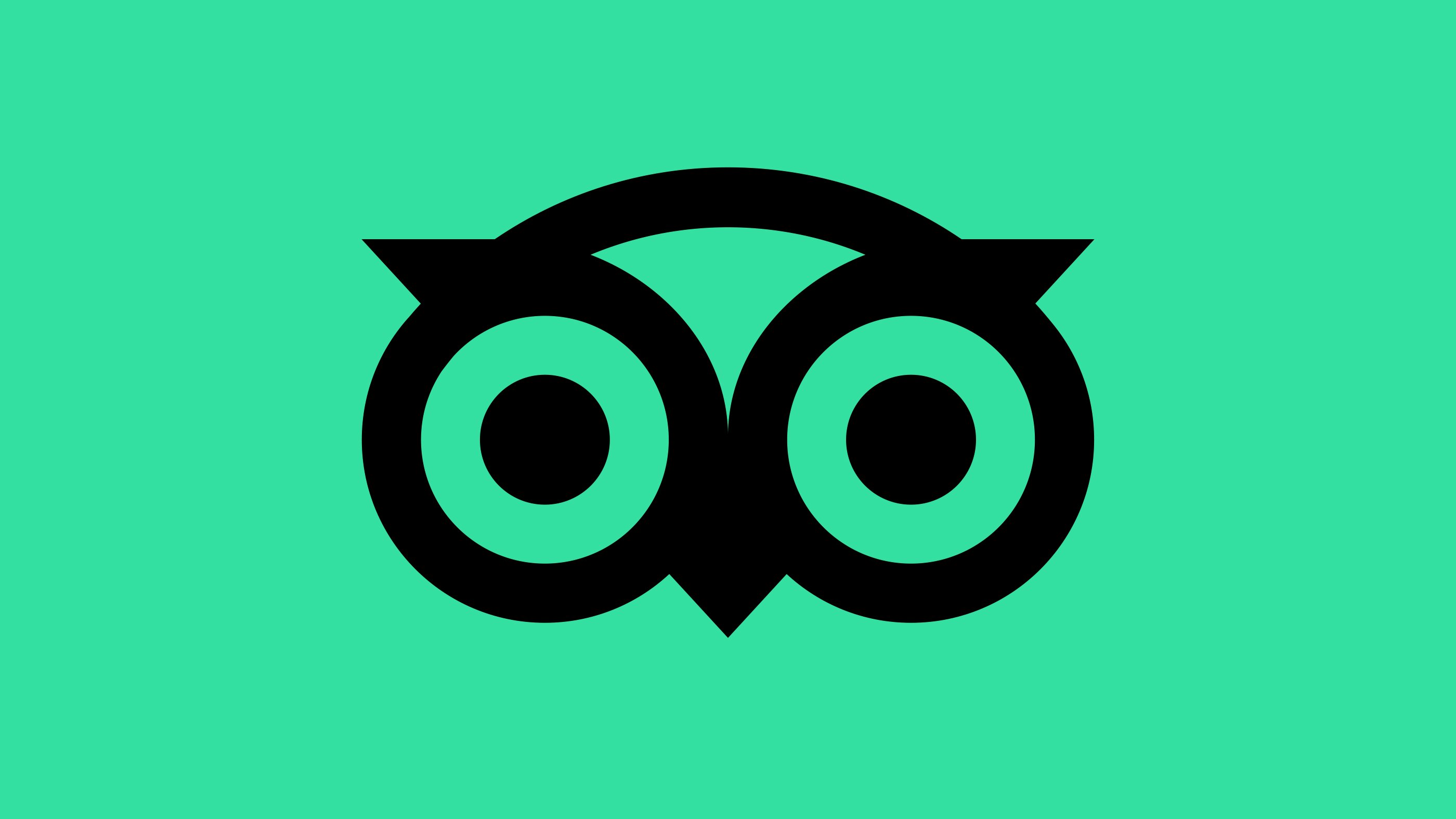
Online travel review giant Tripadvisor has rebranded in January 2020, with a slick logomark and reduced colour palette.
Established in 2000, Tripadvisor is now the world’s largest travel information platform, with a total of 830 million reviews across 8.6 million venues, experiences, and so much more.
The company selected New York-based agency Mother Design for the new look, which has slowly rolled out in recent days and weeks, with more updates to come over the course of the year.
Of the project, Mother Design said:
“Appreciating the current love for and global recognition of the iconic logo, we retained its inherent personality but refined its geometry for better reproduction at all sizes. What was an exercise both in reduction of complexity and amplification of character resulted in a much simpler owl, and a complementary custom typeface by Colophon Foundry which could carry the weight of the real, global, human connection the brand believes in.
“And because Rome wasn’t revealed in a day, Tripadvisor’s refresh won’t be, either. The company intends to roll out their updated look and feel in full over the course of the coming year.”

Tripadvisor owl, Ollie, has been simplified, meaning he now correctly renders in a single colour and is made of a cleaner construction, making him bolder and more striking on the eye.
Thrive's Director, Johnny Woods, said:
"Throughout 2019 and, certainly in the early stages of 2020, I am seeing a lot of evidence of some larger brands opting to really minimalise their brand and really embracing the standalone icon and text-based solution.
"Take a look at recent updates from large corporates like uSwitch, Staples and MailChimp all opting to simplify their logo and offer clarity to the market.
"There is no hiding behind smoke and mirrors, the logos are easily identifiable and so much more memorable.
"Simplifying your logo is a bold step to take and can often be viewed as easy by those less discerning - but ask yourself, how memorable is my brand identity, can I remember and even draw it without reference.
"If the answer is NO - maybe it is time to follow suit and simplify!"
Of course, there’s always a risk of losing trust when an established brand, particularly one of Tripadvisor’s size and genre, mixes things up, but the new look is clean, modern and strongly-reminiscent of where it has moved from with this redesign.
As the changes roll-out over the next year, it’d be hoped that more of Mother Design’s colour palette, including the refreshed TripGreen, makes its way into the website and app.
Does it revolutionise the brand? No. does it bring the company’s identity bang up-to-date to ensure its longevity and trustworthiness in an increasingly modern world filled with clean lines and bright colours? Yes.
View the full project at Mother Design.
Review Hub
Tripadvisor has also unveiled this month its plans to overhaul the platform to essentially become a one-stop-shop for companies to manage their digital reputation with a ‘review hub’.
The review hub will allow companies to manage all of their reviews in one place - Tripadvisor! It will be a subscription-based model but will allow its users to identify review trends across sites such as Google, Facebook, and Yelp, as well as Tripadvisor.