Your hero image is crucial to the impact your website has on first-time and repeat visitors.
It’s not Superman or Wonder Woman, but that first look of your site ‘above the fold’ when a visitor lands, let us explain…
According to one study you have 50 milliseconds to make a good first impression to web users - not long! A great way to do this is with a strong visual impact upon landing on your site, that is the first bit of the screen that shows when a visitor finds your site. This is usually on the homepage, and it is usually a section that sits under the navigation bar.
Depending on the device and browser used, this may be different - your mobile site may display different visuals and content, and at a different scale than your desktop. This is fine - in fact, it’s encouraged - but both must be compelling to the user.
A hero image is the first photo, video, or graphic that shows upon loading and is usually combined with a strong brand message to ensure visitors are satisfied they’ve landed in the right place for their search query.
These hero image sections tend to encourage users to delve deeper, and scroll below the fold (the bit that you can’t see off-screen further down) and can include a CTA (call to action) that encourages a user to navigate to another page or take action in some other way.
Some great examples of hero images include Coca Cola, WWF, and our very own Aycliffe Business Park…
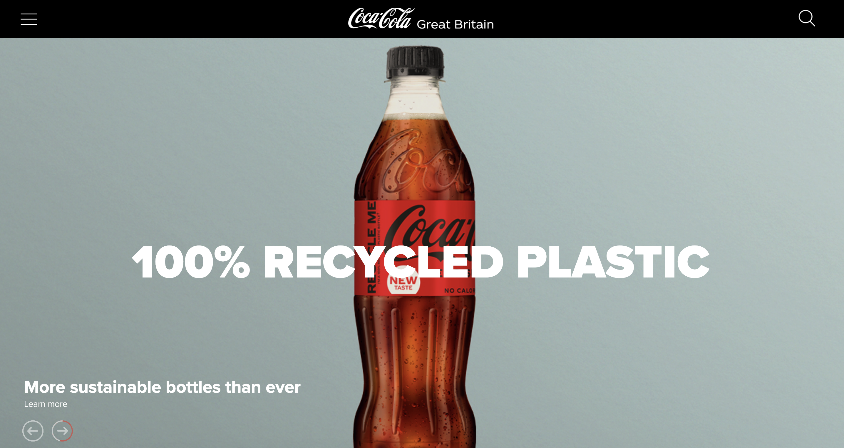
Above: Coca Cola
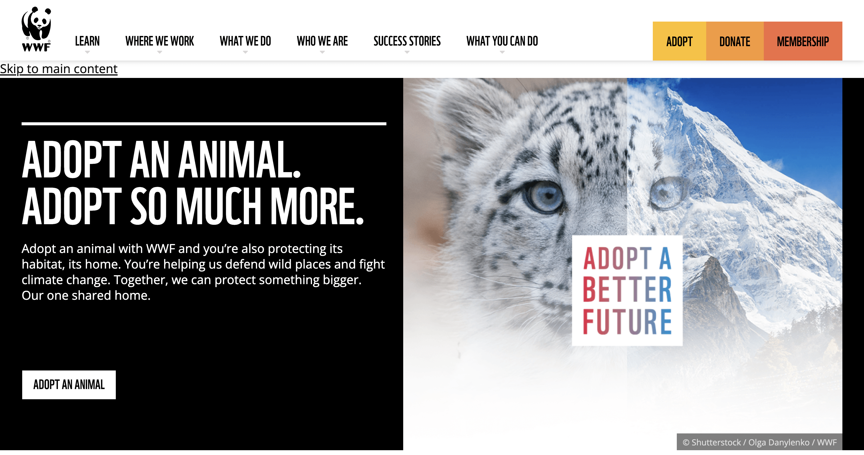
Above: WWF
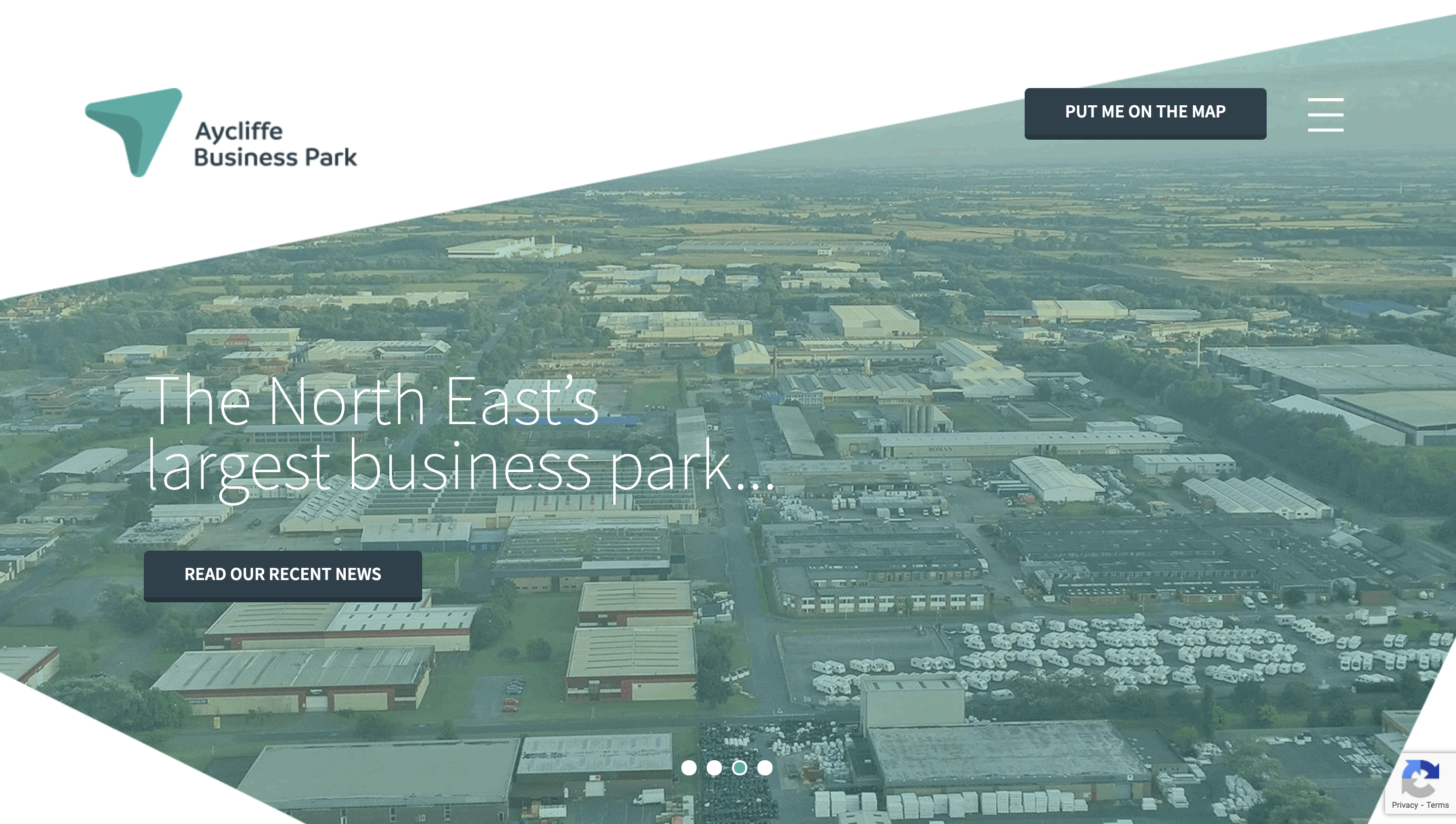
Above: Aycliffe Business Park
Best Practices for Hero Images
Remember your hero image can be changed regularly to create a fresh feel for returning users and should be updated if your brand message changes.
Equally, the technical elements of your hero section are important - if a hero image file is too large it can slow site speed - especially crucial for mobile sites - or can load slowly and encourage users to navigate away from your site. If an image is too small it can appear pixelated and equally encourage visitors to move away from your site!
1. Dimensions for desktop
The ideal size for a full-screen hero image is 1,200 pixels wide with a 16:9 aspect ratio. For a banner hero image, the ideal size is 1600 x 500 pixels.
2. Dimensions for mobile
The ideal size for a mobile hero image is 800 x 1,200 pixels. It must be a responsive file and suit both horizontal and vertical viewpoints. Videos work well for desktop but preferably should be swapped out on mobile to avoid impacts on load times.
3. File sizes
You want to compress your hero image if you have a large file size (anything over 1MB is too big). You can use sites like TinyJPG or Compress JPEG to decrease the size without reducing quality - this is good practice for all site images.
If you want to review your website’s performance and its impact on your audience don’t hesitate to reach out to Thrive about a free website audit.